Friday, August 31, 2012

Review: Four Horsemen Outer Space Men Alpha Phase Gemini Action Figure

With rising costs across the globe, it's hard not to mutter that Gemini cost a little more than previous years' figures. From $40 for 4 to $50 for 3, the largely unpainted figures have changed in size quite a bit and include fewer shared parts than before. Aside from perhaps a couple of plugs and the arms, it seems Gemini is 100% new as are his companions. With more little pieces than ever before, I have no doubt that despite his 3 1/3-inch tall size Gemini looks like he cost a lot to make. Made from about 30 parts, it's clear to me that nobody cut any corners on this one.
[ READ THE FULL REVIEW


Wednesday, August 29, 2012

Review: Four Horsemen Outer Space Men Cosmic Creators Mel Birnkrant Metamorpho Action Figure

I was pretty annoyed that this version of Metamorpho, in pictures, didn't look all that different from the regular painted release. Of course, I was dead wrong about it and in person it looks spectacular. Slathered in metallic paints, the figure really pops and they managed to make a $10 figure look more like a $30 figure, which is important because that's what it costs.
[ READ THE FULL REVIEW ]

Friday, August 24, 2012

Outer Space Men 2.0: Inferno Action Figure

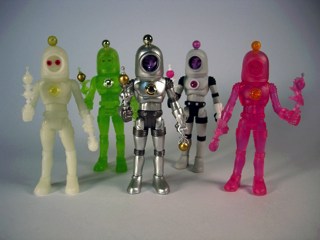
Of the four 2.0 releases of the Outer Space Men figures, Inferno is unquestionably the most compelling.  Along with Metamorpho, these two look significantly different, particularly when compared to the original 2010 release.


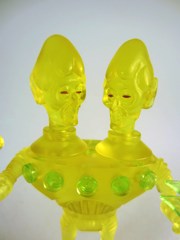
Previously, Inferno was cast in silver plastic and painted in the colors you see, with an opaque flame, gun, and head.  This time around the figure is a mix of silver plastic and clear yellowish orange plastic.  Take note of the feet, hands, gun, chest, chest jewel, head, helmet, and flame as all of these are actually painted clear yellow, while the other body parts are opaque silver.  Because of the high quality paint job, it's actually really hard to tell these are different colored plastics unless you shine a bright light through them.  If a tiny little bit of light didn't peek out through the chest, I'd never notice!

If you ever get the chance to buy these individually, get Inferno first.  The clear red, plus the clear areas on the back of the torso and helmet allow light to shine through so even packaged collectors can enjoy the new lighting feature.   The set of four 2.0 figures is $50 at Store Horsemen.

Overall I'd say the set is an improvement, although perhaps not one enough to warrant another $50 on the set.  If you were dragging your feet before, or missed the first round, these are probably the best ones to get.

One final note-- series creator Mel Birnkrant himself posted a confirmation that the 2011 figures of Mystron, Electron+, Alpha 7, and Commander Comet would not get a 2.0 release as the originals were already more or less perfect.  (I agree.)
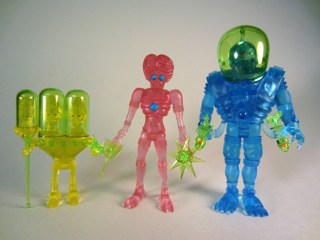
Thursday, August 23, 2012

Bruce Jensen Designs New Custom Mystron Head

Amazing artist and nice fellow Bruce Jensen designed another head!  More are no doubt on the way, but check out his take on Mystron.  It's freaky, with three eyes and tons of spikes on the head.  It also seems more than a little Glyos-y, so here's hoping some of the designs eventually transition to the third dimension.

Outer Space Men 2.0: Astro-Nautilus

Of all the 2.0 releases, Astro-Nautilus is one that seems the least changed.  Go ahead, take a look.  That's the problem when something looks perfectly fantastic the first time.
 

On the left is the original 1.0 version, on the right is the new 2.0 version.  Can you tell the differences?  They're quite subtle, and unless you put them side-by-side you may not notice.  (Or I didn't notice, anyway.)  The original 1.0 version from 2010 has slightly pinker skin, the 2.0 is more purple.  The staffs seem basically the same at first glance, but it turns out the new one is a little more vibrant.  Also, the space suit is different as the metallic bronze color is much shinier and more glossy on the 2.0 release.

Since the packaging is identical and the figures are nearly so, get either. Or both.  2.0 seems to be just barely more in line with the original figure from Colorforms, but this is one of those differences that your wife will mock you for if you dare try to point it out.  (Maybe I speak from experience, maybe I don't.)  I like 2.0 best.

Wednesday, August 22, 2012

Outer Space Men 2.0: Xodiac

The Man from Saturn gets an update, and Xodiac has been given a minor tweak to his accessories.  The original figure was pretty fantastic and, I would've assumed, flawless.  Nothing really beats that metallic blue suit, but it turns out that the accessories were not quite the right shade relative to the original.

The revised 2.0 figure has candylike clear red accessories and a bright orange helmet.  The 1.0 release has pink accessories, and a yellowish green helmet.   The 2.0 figure more precisely matches the photography on the packaging, though, and it seems a smidgen less sparkly than the eye-catching original, although they may be 4% more vibrant.

Surprisingly, it seems the 1.0 accessories more closely match the original bendable figure while the 2.0 helmet seems to be closer in the pictures.  I say "seem to" because I've only seen the original Colorforms figures in person but once at Futuretro in New York last February.  I'd say the 2.0 is, overall, better but you might not notice the difference at first.

Tuesday, August 21, 2012

Outer Space Men 2.0: Metamorpho Action Figure

Here's one of the two most-changed figures in the Outer Space Men 2.0 lineup.   Metamorpho was originally sold in a very light grey color, while the intent was to have more of a white which helps the face pop and glow and all that jazz.  Also, the weapons have clear orbs at the end rather than opaque pink ones.  How did they pull it off?


Simple-- the entire figure is cast in clear colorless plastic, painted white and black as appropriate.  Even the head is clear plastic, with 2 of the 3 heads seeming to be more lively than the original.  The red ape-like face still looks great, but the eyes seem to shine and sparkle more on the 1.0 release.  There's also a weird sparkling quality on the 2.0 figure that's tough to describe, although I assume it comes from the painted clear plastic. 


The white really does make it look like a different figure more in line with the coloring on a Stormtrooper or Clone Trooper from Star Wars, while the light grey looks more or less like it's own thing.   Because I dig this line too much, I decided I needed both.  If you don't have either release, I'd say get whichever is cheaper for you.   (Unless, of course, you're buying these for kids, in which case go with 1.0.  If 2.0's paint scrapes off, the exposed plastic will be clear.)

Monday, August 20, 2012

Outer Space Men Cosmic Creators: Four Horsemen Edition

If you're looking for something new, the last couple of months have been fantastic for Outer Space Men fans!  Pictured above are the recently delivered Cosmic Creators Four Horsemen Edition figures which debuted at their show in New York last year... which I swear I never saw there.  From left to right are Neonautilus, Megamorpho, Glowdiac, and Phospherno in colors which, depending on whom you ask, recall Major Matt Mason's alien buddies or Transformers Generation 2.


Either way, I think they're pretty fantastic.  The clear green accessories are similar in color to the Alpha Phase 2012 figures, and while the previous Cosmic Creators and just-released 2.0 figures look great in person, these neon-ish releases are unquestionably different from the last ones.   You really won't see anything else like this out there right now.

Since I'm off doing convention coverage this week, we'll be posting some automated updates looking at the 2.0 releases starting tomorrow.   I gotta say, like the first batch of Cosmic Creators, these are more expensive and worth it.  If you love you some Outer Space Men, and I do, so I'm pretty happy right now!

Sunday, August 12, 2012

2012 Alpha Phase Outer Space Men Arriving, Pheyden

 As Mel Birnkrant himself might say, "THEY'RE HERE!"  My very own box of 2012 Alpha Phase San Diego Comic-Con 2012 figures showed up on my doorstep Saturday, containing yellow Gemini, a pink (almost Nonilla Pink to you Glyos fans) Orbitron, and the massive blue Cyclops.  It's worth noting both Cyclops and Orbitron are much larger than the usual figures in this line, and the nearly $50 set is made a little less painful when you realize each figure has a high piece count and is nearly 100% new parts.  The Four Horsemen didn't skimp on these, Cyclops even comes in a box!  He's just that big.

I should note, in case some of you were wondering "So where are MY figures?"   I ordered the 2.0 figures and Four Horsemen Cosmic Creators series as well, neither of which have shipped to me, although a few people have reported getting 2.0 sets.  As such, sit tight, things are moving along still.

A big surprise to me was to finally see Cylcops up close, he has removable armor and a little surprise under it.  The head of Pheyden from Onell Design's Glyos line can be seen on his chest, and the real surprise is that this may not be a coincidence.

Mel Birnkrant has the only Outer Space Men page you should read (thank you for reading this one, by the way) and on it he has some interesting annotations on Cyclops which, I assume, you may have read.   Mel says:

"...Meanwhile, Matt [Doughty of Onell Design] called me one day, and we got into a conversation that lasted all afternoon.  We began to discuss the Cosmic Connection and the almost spooky affinity that he feels for the OSM.  And he pointed out something to me that I find rather uncanny!  THE EMBLEM ON CYCLOPS’ CHEST IS “PHEYDEN”!

"So, we agreed that to ask Eric [Treadway of The Four Horsemen] to be aware of that, and subtly bring the image out.  We went back and forth with sketches and discussion and both did drawings.  I soon realized that they were unnecessary!  In the end, I simply copied the photo of the emblem and in 2 minutes on Photoshop added two lines to represent the teeth and two dots to indicate small balls for eyes. Another solution was to just add the teeth lines and let the negative space and the shadow it creates, imply the eyes.  Subtle and more secretive; the more I looked at it, the more I liked it best.  It allows the viewer to see and experience what Matt saw.  The teeth alone are all it needs.  Eric agreed!  To the uninitiated, this will just look like part of the 45 year old design, which, indeed, it is!  But this really establishes a connection with Pheyden, originating somewhere, out there, beyond the Milky Way!"

So there you have it! Another Easter Egg in this great line.  We'll be reviewing the new guys in Figure of the Day on 16bit.com and posting them here as well, so stay tuned as we get to them in the coming weeks!  As always thanks for reading and for your patience on our getting to all the awesome new stuff.